Play Mode
- Overview
- Setting Play Mode start
- Quickstarting from any element
- Entering Play Mode
- Changing order of options
- Audio in Play Mode
- Custom styles
- Debug
Overview
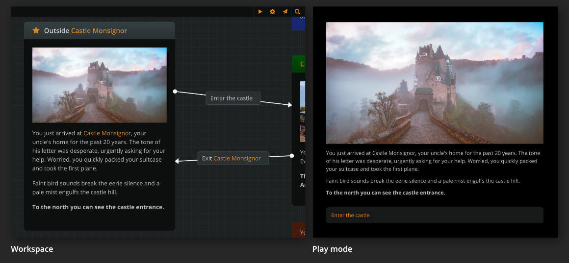
On play mode, you can test and prototype your project as a choose-your-path game. Every turn, the player advances the story by choosing one of the available options.
Μore specifically:
- The game begins at the starting element.
- At each turn, Arcweave renders the content of one element—the current element.
- The current element's cover image or icon appears on the top of the Play Mode window.
- The current element's components images or icon thumbs appear under the cover image
- The current element's text content appears under it.
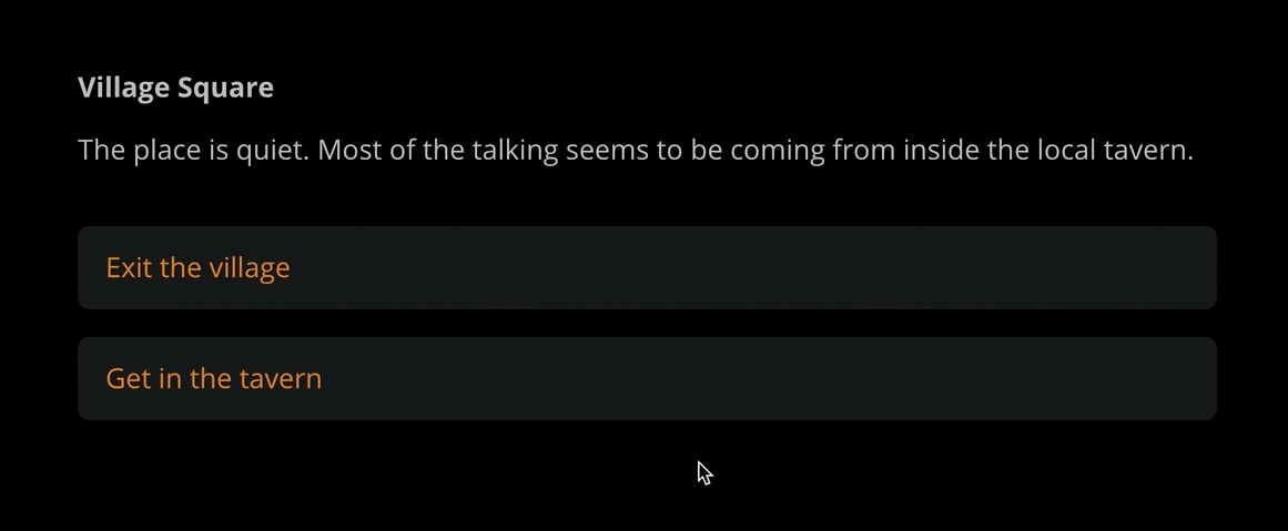
- Any available outgoing connections appear as clickable option buttons at the bottom.
- If an element has only one connection without a label, a blinking arrow will appear at the end of the element's text content. Clicking anywhere in the content will advance the story to the next element.
{info} To let others play your project, you must make it public, first.
Setting Play Mode start
To run your project on Play Mode, you must first Set the Play Mode start.
To set the Play Mode start:
- Right click on an element.
- Select Set Play Mode start.
To remove the play mode start:
- Right click on the element.
- Select Remove Play Mode start.
{info} There can only be one starting element in a project.
Quickstart from any element
You can also choose to quickstart Play Mode from any element in your project. To do that:
- Right click on an element.
- Select Quickstart Play Mode from here.
Entering Play Mode
To run your project on Play Mode, click on the play icon  at the top right of the workspace.
{success} Making changes in your project updates Play Mode in ⚡ real-time!
Changing order of options
The Play Mode is actually the only environment where you can reorder an element's clickable options.
While running your project on Play Mode, drag and drop options to the desired order. Arcweave will save your preferences.
Audio in Play Mode
When you attach audio assets to elements, these audio files will automatically play during transitions between elements in Play Mode.
Audio Controls
The Play Mode interface includes audio controls in the top navigation bar:
- Click the audio icon to access volume controls
- Adjust the volume slider to set your preferred audio level
- Click the mute icon to toggle audio on/off
Audio Playback Behavior
Audio settings and playback states are maintained throughout your play session, allowing for a consistent audio experience as users navigate through your interactive story.
Custom Styles
Arcweave allows you to customize the appearance of the Play Mode interface using custom CSS via the Style Editor.
To access the Style Editor:
- Enter Play Mode by clicking the play icon .
- Click the Style Editor icon (represented by a palette icon) in the Play Mode top bar.
Using the Style Editor
The Style Editor panel provides a dedicated environment for writing and managing your custom CSS:
- Interface: The editor features CSS syntax highlighting and line numbers for easier code readability and navigation. The panel itself is resizable; you can drag its left edge to adjust the width.
- Writing CSS: Enter your custom CSS rules in the editor.
- Real-time Validation: As you type, the editor automatically validates your CSS.
- If errors are detected, an error count and an alert icon (!) will appear at the bottom of the panel.
- Clicking the error count/icon area will display detailed error messages (e.g., "Line 5: Invalid property name").
- The Save changes button will be disabled until all validation errors are resolved.
- Live Preview: Valid CSS rules are reflected in the Play Mode window in real-time, allowing you to see the effects of your changes instantly.
- Saving: Once you are satisfied and there are no validation errors, click the Save changes button to persist your custom styles. Your styles will be applied whenever you or others run this project in Play Mode.
Keyboard Shortcuts
The following keyboard shortcuts are available within the Style Editor:
| Shortcut | Action |
|---|---|
Tab |
Indent the current line (inserts 2 spaces) |
Shift + Tab |
Outdent the current line (removes 2 spaces) |
Available CSS Selectors
You can target various parts of the Play Mode UI using specific CSS classes. Here are some of the commonly used selectors based on the underlying structure:
| Selector | Description | Notes |
|---|---|---|
.prototype |
The outermost container for the entire Play Mode interface. | Applied higher up in the application structure. |
.prototype__main |
The main content area, excluding potentially fixed elements. | |
.prototype__root |
A primary wrapper within prototype__main. |
Scrollable. Contains the element-specific div. |
#el-[element-id] |
The div specific to the currently displayed element. | e.g. el-38375689-9e4d-430e-954c-65205eb622fe |
.prototype__wrapper |
An additional wrapper inside the element-specific div. | Contains .prototype__content. (Note: .prototype__options is sibling to .prototype__content if following older structures, or within if structure changed) |
.prototype__content |
The container holding the element's visual parts and text. | Contains .prototype__header, .prototype__body, and .prototype__options. |
.prototype__header |
Container for media (cover, icon, components without cover). | |
.prototype__body |
Container for the element's main text content area. | Now contains a .prototype__text div that wraps the editor. |
.prototype__text |
Direct wrapper for the rich text editor. | Found inside .prototype__body. Gets the .showArrow class when applicable. |
.prototype__text .editor .editor-content |
The bounding box for the element's text content. | Styles here affect the entire text block (e.g., background, padding). Contains .ProseMirror. |
.prototype__text .editor .ProseMirror |
The direct container of the element's formatted text (paragraphs, links, etc.). | Use this selector to target specific HTML tags within the text, like p, a, strong. E.g., .prototype__text .editor .ProseMirror p { ... }. |
.prototype__media |
Holds the cover image, embed, or icon. | |
.prototype__components |
Grid container for attached components. | |
.prototype__options |
The container holding the clickable choice/option buttons. | |
.prototype__option |
An individual choice button. | Contains the option text directly (use v-html). |
.prototype__text.showArrow |
Styles the text container when the single-path arrow is visible. | The arrow is typically an ::after pseudo-element on this div. |
Notes:
- To style the text of an option button, target
.prototype__optiondirectly (e.g.,.prototype__option { color: blue; }or.prototype__option p { font-weight: bold; }). There isn't a separate label class. - Always use your browser's developer tools (F12) to inspect the elements in Play Mode and confirm the exact, current class names and structure you need to target.
Example:
Here's an example reflecting some of the default styles in Play Mode. You can use this as a starting point for your own customizations:
@import url('https://fonts.googleapis.com/css2?family=Lora:ital,wght@0,400..700;1,400..700&display=swap');

.prototype__wrapper {
  padding-top: 0px;
}

.prototype__content {
  display: flex;
  flex: 1;
  flex-flow: row-reverse;
  max-width: 100%;
  padding: 0;
}

.prototype__header {
  display: flex;
  flex-basis: 50%;
}

.prototype__body {
  flex: 1;
  padding: 2rem;
  font-family: 'Lora', serif;
}

.prototype__text .editor .editor-content {
  font-size: 22px;
}

.prototype__media {
  flex-flow: column;
  flex: 1;
}

.prototype__media img {
  object-fit: cover;
  width: 100%;
  height: 100%;
}

.prototype__components {
  grid-gap: 0;
  height: 100%;
}

.prototype__components--pushed {
  display: none;
}

.prototype__components.single > .comp {
  background: #1d1f1f;
}

.prototype__option {
  border-radius: 0;
  border: 1px solid #292d2d;
  background: none;
}

@media (max-width: 767px) {
  .prototype__wrapper {
    padding-top: 40px;
  }
  .prototype__content {
    flex-flow: column;
  }
  .prototype__body .editor .editor-content {
    padding: 0 0 40px;
  }
  .prototype__header {
    flex-basis: 0;
  }
}
Targeting Specific Elements
Beyond the general classes, you can apply styles to specific elements shown in Play Mode. Each element's content is wrapped within a div that has a unique id attribute, typically starting with el-.
To find an element's ID:
- Navigate to the element in Play Mode.
- Open your browser's developer tools (usually by pressing F12).
- Use the element inspector tool to select the main content area of the element.
- Look for a
divelement that has anidattribute likeid="el-abcdef12345...". Copy this ID (including theel-prefix).
You can then use this ID in your CSS selectors with the standard ID selector (#):
/* Style the body text only for a specific element */
#el-your-specific-element-id .prototype__text .editor {
  font-family: 'Courier New', monospace;
  font-size: 18px;
}

/* Style the options only for a specific element */
#el-your-specific-element-id .prototype__option {
  background-color: darkred;
}
This allows for highly granular control over the appearance of individual parts of your story.
{info} Experiment with different CSS rules and selectors to achieve your desired look and feel. Use your browser's developer tools (usually by pressing F12) while in Play Mode to inspect elements and discover the most specific selectors for your needs.
Debug
When Arcweave renders an element containing arcscript segments, it runs them in the order they appear. If those segments assign new values to variables, you can inspect the changes using the Play Mode's debugger.
To open the debugger:
- Click on an empty area of the Play Mode's browser window.
- Click on the Debug icon, at the top navbar.
- You can resize the debugger by dragging the left vertical line separating it from the Play Mode current view.
The debug drawer shows the number, name, type, before and after value of each of the project's variables, tracking any changes in real time. You can change on the fly the before values of the variables to inspect how their after value changes in real-time.
{success} When your game's logic doesn't work as expected, the debugger helps you define and fix bugs by demonstrating irregular behaviours of variables.
Debug info is visible only to the owner and editors of a project. If you can see the other UI elements but not the debug button, make sure that you are either the owner or an editor of the project.
{primary} To have an element "revisit" itself in Play Mode you can do it via a connection to a jumper linking to that element.