Components
- Overview
- Creating components
- Creating folders
- Opening and editing components
- Setting a component's cover image
- Component attributes
- Attaching components to component lists
- Attaching components to elements
- Deleting components and folders
Overview
A game isn't only its plot. It is highly likely that the game you are making includes:
- characters
- locations
- inventory items
Moreover, depending on what the story is about, it may also include some of the following—and these are just examples:
- clues
- magical spells
- emotions
- weather conditions
- memories
- time periods
- all sorts of stats
To store all these different things, Arcweave uses components.
Components are very flexible and you can use them according to your project's needs.
You can find and manage your project's components and their folders on the upper part of Arcweave's sidebar, under the Components tab.
Creating components
To create a new component, go to your components and:
- Click on + New component at the end of the list.
or:
- Right-click on an empty area of the list.
- Select Create Component from the menu.
To create a new component over an existing component:
- Right-click on the existing component's name.
- Select Create Component from the menu.
or:
- Hover the mouse cursor over the existing component's name.
- Click on the (+) icon that appears.
- Select Create Component.
To create a new component inside an existing folder:
- Right-click on the folder's name.
- Select Create Component from the menu.
or:
- Hover the mouse cursor over the folder's name.
- Click on the (+) icon that appears.
- Select Create Component.
Creating folders
To create a new folder:
- Go to your components, on the sidebar.
- Right-click on an empty area of their list.
- Select Create Folder from the menu.
To create a new folder over an existing component:
- Right-click on the component's name.
- Select Create Folder from the menu.
or:
- Hover the mouse cursor over the component's name.
- Click on the (+) icon that appears.
- Select Create Folder.
To create a subfolder inside an existing folder:
- Right-click on the folder's name.
- Select Create Folder from the menu.
or:
- Hover the mouse cursor over the folder's name.
- Click on the (+) icon that appears.
- Select Create Folder.
Opening and editing components
To open a component for editing, find it in the list of your components and click on its name or thumbnail.
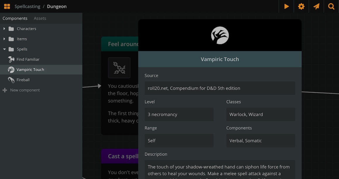
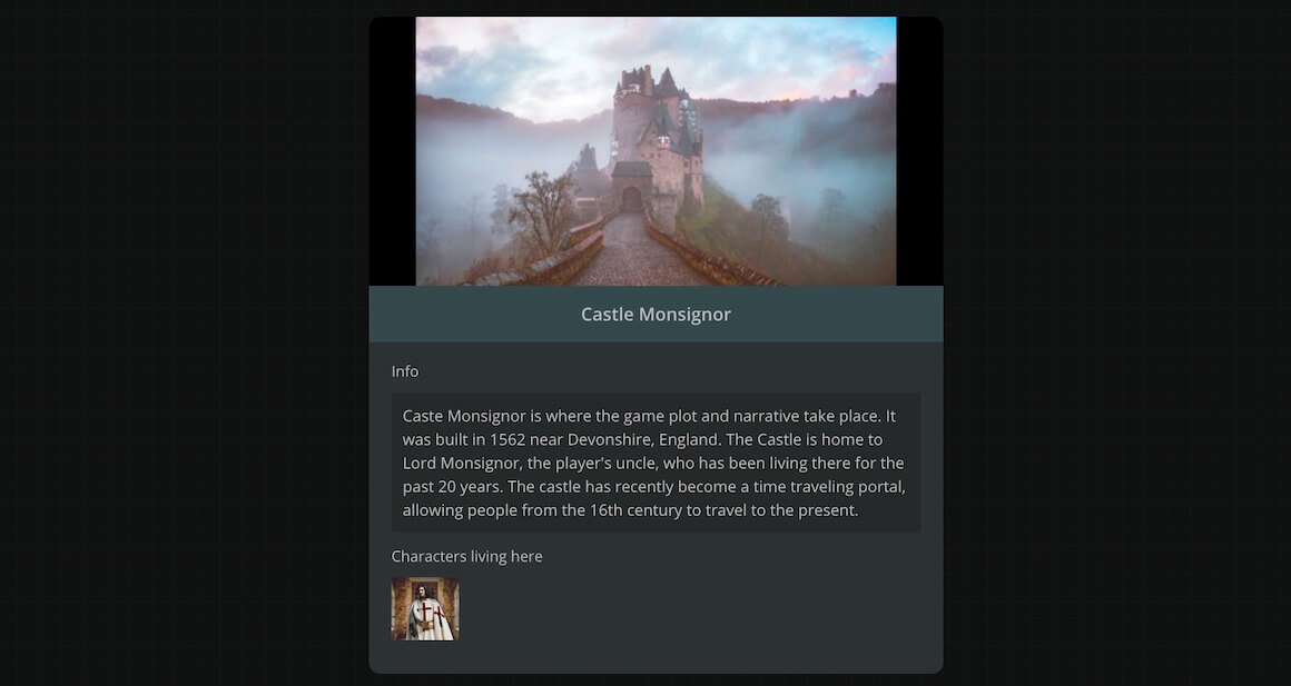
Each component consists of a title, a cover image, and a set of attributes.
To rename a component, click on its name field.
To change a component's cover image:
- Hover the mouse cursor over the image.
- Click on Change cover.
- Browse and select an image from your assets or the icon library.
Alternatively, you can drag and drop an asset from the sidebar into the component cover area.
{success} An asset will also be created and attached to a component as cover when dropping an image file from your drive or browser at the top area of the component (while in component edit mode).
Component Attributes
A component can hold three types of attributes: Rich Text fields, string fields or component lists.
Rich Text fields
Use rich text fields to store any information in the form of [Label: Text content].
For example:
- Descriptions: write a short description for your character or location.
- Stats: list your character's scores (e.g.
Charisma: 12), a weapon's damage (e.g.Damage: 1d4), or a spell's info (e.g.Duration: 3 rounds). - Backstory: keep characters' backstories in the characters' backpockets for easy access.
The values of these fields have Rich Text capabilities (bold, italics, underline) and you can even use Mentions!
String fields
Similar to Rich Text fields, although it is just a string without any of the Rich Text capabilities.
These fields could be particularly useful for Project Exports or using our API as they don't contain any HTML Tags.
Component lists
You can also attach components inside other components, using component lists.
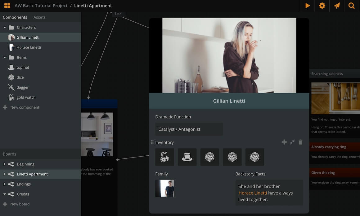
You can use this to list:
- Character inventory: add the items carried (as components) into a character's component.
- Spellbook: list the spells they know.
- Character relations: list other characters that have important relations to the component character.
- Contents: in a location's component, list the items or characters found there.
Component lists also have a label field, so name each of them according to your needs.
The attached components appear with their thumbnail. Click on the thumbnail to open the attached component.
Creating component attributes
To create a text field or a component list:
- Go to your Components.
- Open a component by clicking it.
Then, if the component has no other attributes:
- Click on Add String field, Add Rich Text field or Add component list.
Otherwise:
- Hover the mouse cursor over an existing attribute.
- Click on the (+) icon at the attribute's top right corner.
- Select String field, Rich Text field or Component list.
The newly created attribute will appear above the clicked one.
Resizing attributes
By default, attributes span the full width of a component's window, but you can resize an attribute to span only half-width.
To resize an attribute:
- Hover the mouse cursor over it.
- Click on the double arrow icon
 appearing at its top right part.
Deleting attributes
To delete an attribute:
- Hover the mouse cursor over it.
- Click on the trash can icon
 appearing at its top right part.
Reordering attributes
To reorder an attribute:
- Click and hold it from the dots icon, at their top left corner.
- Drag and release it above or below another attribute.
Attaching components to component lists
To add a component to a component list:
- Open the parent component—the one that carries the list.
- Go to your Components on the sidebar and find the one you want to attach.
- Drag and drop it into the component list.
{success} Drag and drop components to reorder them inside a list or to attach them from one list to another.
Attaching components to elements
You can also attach components to elements. To do this:
- Go to your Components on the sidebar.
- Drag the component of your choice and drop it inside the element of your choice.
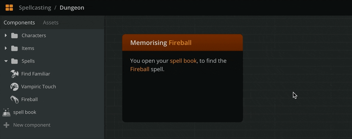
Use this feature to create a visual reference to the component during a plot point or dialogue beat and to easily access the component—just click on the attachment and the component will open.
{info} The attached components of an element also render on Play Mode.
Drag and drop attached components to reorder them inside an element or to move them from one element to another.
To remove an attached component, drag and drop it from the element to an empty workspace area.
{info} Removing a component from an element simply removes the reference and does not delete the component.
Deleting components or folders
To delete a component or component folder right click on the component row in the sidebar and select Delete from the menu.
{info} When deleting a component all mentions and references of this component will be removed as well.
{warning} Deleting a component folder will ALSO delete all components inside that folder and its subfolders