Elements
- Overview
- Examples
- Creating elements
- Adding and formatting text
- Adding arcscript segments
- Element attributes
- Selecting elements
- Resizing elements
- Deleting elements
- Changing theme
- Cover image
- Attaching audio assets
- Attaching components
Overview
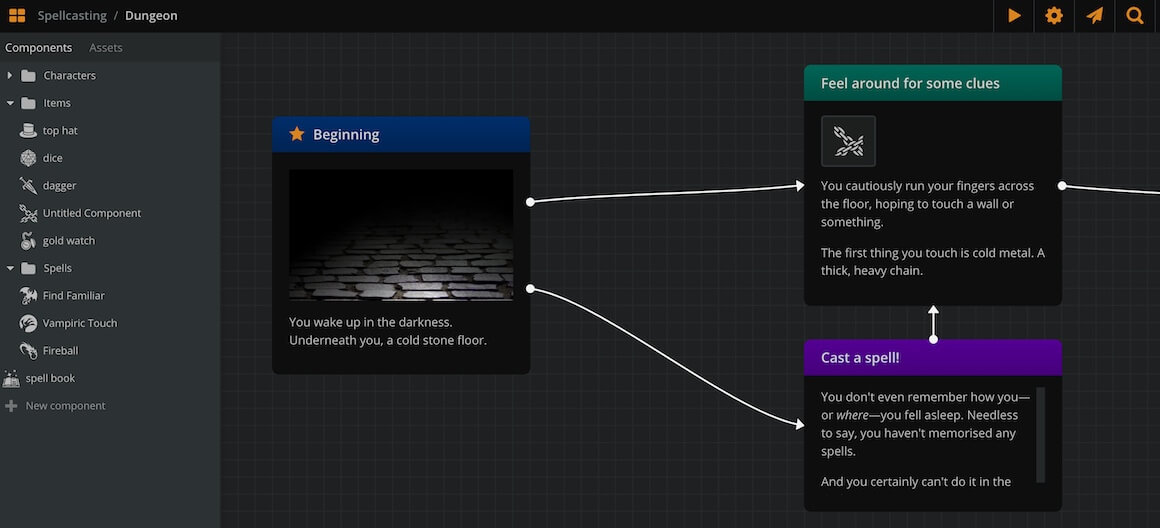
Elements are the most important entity in a board. They are the building blocks of your diagrams, each of them containing a small part of your game.
By connecting elements together with connections, you allow the player to make choices and progress through your game.
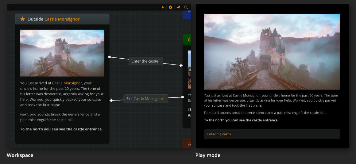
{primary} You can play-test the flow of your elements and connections on Play Mode.
Creating elements
There are 3 ways to create an element:
- Double click on an empty area of the current board.
- Right click on an empty area of the current board and select Create Element from the menu.
- Drag and drop the New element icon
 (at the bottom left corner of the workspace) on a empty area of the current board.
Adding and formatting text
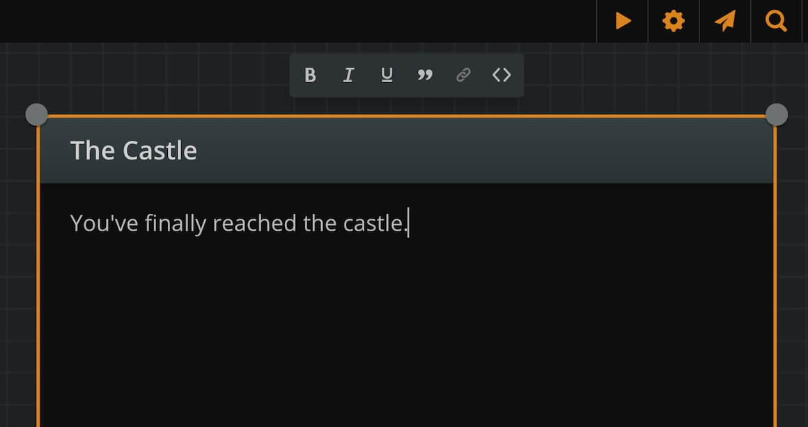
Title and content
Each element has a title (the top, coloured part) and a content area (the main black part). To edit either, simply double-click on it.
To cycle editing between title and content, press the tab key.
To exit editing mode press esc or click on an empty area of the board.
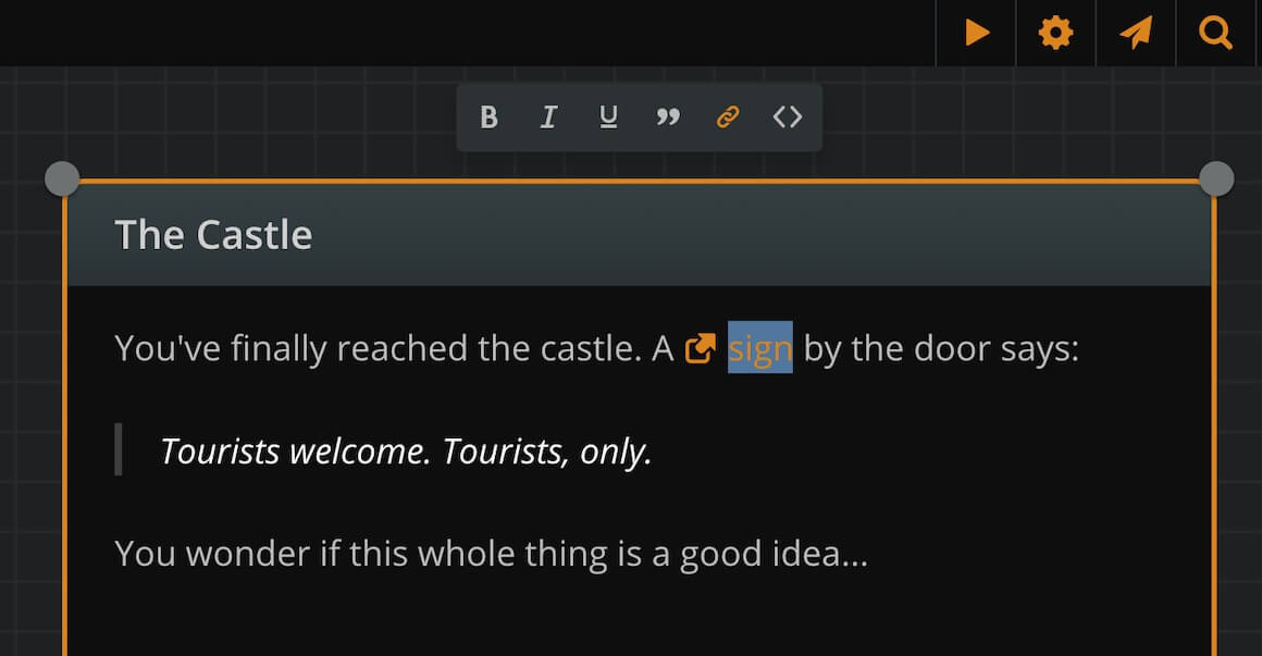
Formatting menu
Elements support rich text format in both title and content. From the formatting menu, choose bold, italics, or underline.
Format a paragraph as blockquote, to make its text stand out as a quote or a sign.
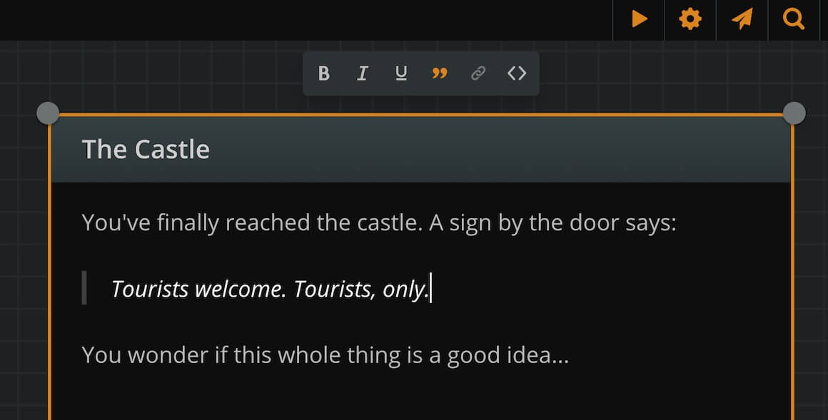
You can also embed a link to a selected piece of text.
Quick formatting
Type *one asterisk* or _one underline_ and it will automatically transform to italic text while you type.
Type **two asterisks** or __two underlines__ and it will automatically transform to bold text while you type.
You may also use the usual shortcuts of Ctr/Cmd+B, Ctr/Cmd+I and Ctr/Cmd+U for Bold, Italic and Underline respectively.
Adding arcscript segments
Finally, you can add code segments to your element content, assigning values to variables or manipulating the text output.
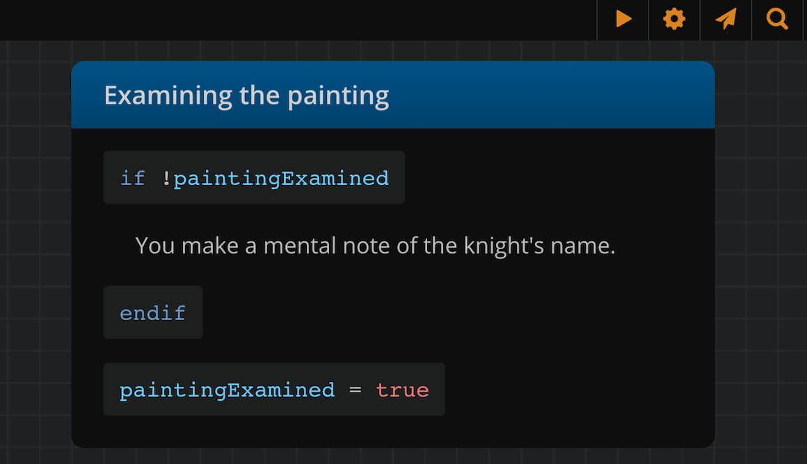
Arcweave uses its own scripting language, called arcscript.
To add arcscript code inside an element click on the arcscript segment icon in the toolbar while editing the element content. To exit the block press Enter.
{primary} To mark/unmark an arcscript segment you can also use the shortcut Ctr/Cmd+Shift+C.
Element attributes
An element can hold four types of attributes: Rich Text fields, string fields, component lists and asset lists
These attributes, along with other element details like word count and ID, are managed in the Element Properties dialog.
Rich Text fields
Use rich text fields to store any information in the form of [Label: Text content].
For example:
- Descriptions: write a short description for your character or location.
- Stats: list your character's scores (e.g.
Charisma: 12), a weapon's damage (e.g.Damage: 1d4), or a spell's info (e.g.Duration: 3 rounds). - Backstory: keep characters' backstories in the characters' backpockets for easy access.
The values of these fields have Rich Text capabilities (bold, italics, underline) and you can even use Mentions!
String fields
Similar to Rich Text fields, although it is just a string without any of the Rich Text capabilities.
These fields could be particularly useful for Project Exports or using our API as they don't contain any HTML Tags.
Component lists
You can also attach components inside other components, using component lists.
Component lists also have a label field, so name each of them according to your needs.
The attached components appear with their thumbnail. Click on the thumbnail to open the attached component.
Creating element attributes
To manage an element's attributes or view its details:
- Find the element you wish to inspect.
- Right-click on it and select Properties....
This will open the Element Properties dialog. The dialog has two tabs:
- Attributes: This tab allows you to manage the element's attributes. If the element has no attributes yet, click on Add String field, Add Rich Text field, Add component list or Add asset list to add the first one. If attributes already exist, hover over an existing attribute and click the '+' icon at its top right corner, then select the type of attribute to add. The newly created attribute will appear above the clicked one.
- Details: This tab displays information about the element, including its unique Element ID (which can be copied to the clipboard) and word counts for the title, content, and total.
Resizing attributes
By default, attributes span the full width of a component's window, but you can resize an attribute to span only half-width.
To resize an attribute:
- Hover the mouse cursor over it.
- Click on the double arrow icon
 appearing at its top right part.
Deleting attributes
To delete an attribute:
- Hover the mouse cursor over it.
- Click on the trash can icon
 appearing at its top right part.
Reordering attributes
To reorder an attribute:
- Click and hold it from the ••• icon, at their top left corner.
- Drag and release it above or below another attribute.
Attaching components to component lists
To add a component to a component list:
- Open the element properties of the element that carries the list.
- Go to your Components on the sidebar and find the one you want to attach.
- Drag and drop it into the component list.
{success} Drag and drop components to reorder them inside a list or to attach them from one list to another.
Selecting elements
To select an element, simply click on it.
To select multiple elements, hold Shift or Ctrl/Cmd and either:
- Click each element consecutively.
or:
- Click and drag to create a selection rectangle.
{primary} You can similarly select entities of any kind: connections, notes or jumpers.
Resizing elements
To resize an element, select it and drag its corners or edges to the desired size.
{primary} You can quickly auto-resize a selected element to fit to its content by double clicking on any of its corner or edge resize handles.
Deleting elements
To delete an element, you can either:
- Select it.
- Press Delete or Backspace.
or:
- Right-click on it
- Select Delete from the menu.
Changing theme
To change the color theme of an element, right click on it and select one of the available colors from the menu.
Cover image
Elements can optionally have one cover image. On Play Mode, the image is rendered above the element's text content.
As cover images, you can use your project's assets, icons from Arcweave's icon library or emebed a Youtube video. To assign a cover image from either sources:
- Right-click on the element.
- Select Set cover.
- Select a tab: My Assets or Icon Library or Embed.
- Choose an image, an icon or paste a youtube video URL.
{primary} To use your own images in a project, you must first upload them as assets.
Another way to assign a cover is to drag an image from the sidebar's assets list straight into the desired element.
To change an element's cover, select Set cover again or drag a new asset into it.
To remove an element's cover:
- Right-click on the element.
- Select Remove cover.
Attaching audio assets to elements
Elements can optionally have one or more attached audio assets. The audio assets play during Play Mode, upon the element's rendering, as loops or one-shots.
To attach an audio file to an element you must first upload it as an asset. To assign an uploaded audio asset to an element, drag and drop it from your assets list into the element.
Once attached, click on the asset to open its settings menu. This allows you to preview the audio file's playback, as well as assign one of the three following options regarding its play mode behaviour:
- Play clip once: the audio assets plays once, from start to finish.
- Loop clip indefinitely: the audio asset loops, i.e. restarts every time it reaches its end.
- Stop playing all instances of clip: this stops the existing playback of the asset, if already happening.
{primary} To stop a looping asset, you must attach the same asset onto one of the following elements and set it to "Stop playing all instances of clip."
To move audio assets between elements, drag them from one element and drop them into another. To remove an attached audio asset, drag and drop it from the element to an empty workspace area.
{info} Removing an audio asset from an element simply removes the reference and does not delete the asset.
Attaching components to elements
You can attach components to elements. See components.